Pointer Blog
6min remaining
An animated product demo in 34 lines of code.
August 26, 2022
Yup, that's right, just 34 lines of code to build this impressive scroll effect!
At pointer.gg, we love doing a lot with a little, because why impress people with complicated code when you can impress them with simple code?
Today we're gonna build a badass product demo using only a couple of css properties and a sprinkle of framer-motion animations.
Here's the effect we're going to implement:
So what is even happening here? It's a little hard for the brain to digest because there's lots of things moving around.
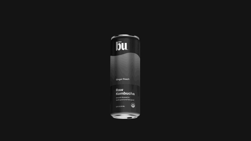
At first glance you might think there's just one image of a kombucha can rotating with some sort of color filters applied, but that's actually not the case.
If you look closely at the label of each can, you'll notice each can has a distinct flavor and there are actually five different images at play here.
To make this more obvious, below is another example that excludes rotation and utilizes more visually distinct images.
Now we can see more clearly that as we scroll, we simulaneously reveal the next image and conceal the previous image.
To get the most out of this effect, we want each photo in the series to have a similar size and structure so that we don't end up with too many disconitinuties during the transition from one photo to the next.
For the purpose of this tutorial, we've dug up some product photos for a brand of kombucha because the photos share a lot of similarities to each other.
To begin implementing this effect let's just render a series of pages, each containing a different photo.
Here we have an App component that renders a list of pages.
Each page takes up the full width and height of the viewport and contains a centered image. The background color of each page is set to match the background color of the image for that page.
If we scroll, we notice that each image moves upward along with the page that contains it. However this is not what we want. Instead we want the images to remain in the same vertical position essentially ignoring the scroll.
Well a good way to do that is to put them in a fixed position container which will position them relative to the viewport instead of relative to their parent.
Here we've introduced a new Box around the image that we've given a fixed position, keeping it positioned relative to the viewport even as we scroll.
We've added inset={0} to instruct the box to take up the full dimensions of its container, in this case the viewport.
We've also moved our centering logic onto this box to keep the image centered.
But there's a pretty major problem. When we scroll in the above example, we just see the tropical kombucha image for the whole time.
What's happening is that all of the images are positioned directly over top of each other. So the other images are there, we just can't see them because they're being covered by the top image. To fix this, we want to hide any part of an image that falls outside of the bounds of its page.
You might be tempted to reach for overflow: hidden here, but sadly it doesn't have the effect we want because the fixed position element is now positioned relative to the viewport and will no longer obey certain characteristics of its parent, inlcuding overflow.
As you can see, setting overflow="hidden" doesn't appear to do anything in this case. However, there's another css property that can rescue us: clip-path.
Clipping is a technique used to cut away parts of an element.
Imagine you draw an enclosed path on a piece of paper and then cut along the path using a pair of scissors, throwing away any part that's not contained within the path.
Well this is similar to the way clipping works and by using clip-path to draw an enclosed path around the border of an element, we can throw away all graphics that fall outside of the element's bounds.
Here's what happens if instead we use clip-path to clip the contents that overflow the bounds of the page.
Look at that, less than 20 lines of code and we've already got a pretty cool effect!
Now we just need to add some rotation as we scroll.
To do this, we'll utilize a few goodies exported from framer-motion, a popular animation library for react.
framer-motion gives us a useScroll hook that lets us tap into the scroll progress of the page.
The useScroll hook returns an object with the following shape:
For our example we'll be using scrollYProgress because it will give us the scroll progress (between 0 and 1) in the y direction.
But hold your horses, cause scrollYProgress isn't just some plain old number that we can use, instead it is has type MotionValue<number>.
Motion values are a core building block of framer-motion and they're important because they're able to track values outside of the react render loop.
This means that, unlike react state, we can update a motion value without causing an entire react subtree to rerender.
Motion values behave more or less like observables:
Ok cool, but what does this have to do with animation?
Well, what we really want is to be able to hook up a motion value to a css property so that whenever the motion value changes, the css property is set to the new value.
As it turns out, all we have to do to bind a motion value to a css property is render a motion element, passing the motion value to a style property.
Here the motion.div will see that it was passed a motion value and will automatically subscribe to changes using the motion value's onChange function.
Whenever the value in scrollYProgress changes, the motion.div will be sure to set the rotation of the element equal to the new value associated with scrollYProgress.
We can make any element a motion element simply by prefixing it with motion..
So for example, we could do <motion.img />, <motion.span />, or <motion.h1 />.
We're gonna do something even trickier though and turn our chakra Box into a motion component by invoking motion on it.
This creates a hybrid component that can accept chakra props such as w, h, and bg as well as motion props such as style and animate.
Let's see what happens if we throw some of this animation logic into the sandbox we were working on earlier.
Well... apparently not much happens.
If we look super closely we can see that the element actually is rotating as we scroll, but the problem is that the value of scrollYProgress only ranges from 0 to 1 and the rotate property is interpreting this value as a rotation in degrees.
So basically once we scroll all the way to the bottom of the page, our element will have rotated only 1 degree clockwise.
We can fix this by using framer-motion's useTransform hook. useTransform takes in a motion value and returns us a new motion value with some sort of transformation applied.
In this case, we want to create a new motion value which ranges from 0 to 360 degrees.
Here rotate stores the motion value returned by useTransform.
This motion value will update automatically whenever the value of scrollYProgress changes.
Moreover, when scrollYProgress changes, the transform function passed to useTransform will be run on the new progress value and the resulting value will be set as the new internal value of rotate.
We could stop here, but if you play around with the sandbox, you'll notice that the motion is rather abrupt.
So for our last step, we're going to smooth out the motion using a spring.
For this we'll grab the useSpring hook from framer-motion and pass it the motion value stored in our rotate variable.
Similarly to useTransform, useSpring takes in a motion value and returns a new motion value.
The returned motion value more or less reflects the input motion value, but includes extra intermediate values that are calculated according to the spring parameters provided.
You'll notice that the motion is now significantly smoother.
Feel free to play around with the mass value and see how it affects the motion.
We find the following to be a good starting place for spring parameters:
And with that, we're done! CSS is immensely powerful and with some clever usage we can create awesome effects with clean and minimal code. So get out there and make some fun things!